Introducing Luma
The Foundation for your Design System
A set of beautifully designed components that you can customize, extend, and build on. Start here then make it your own. Open Source. Open Code.
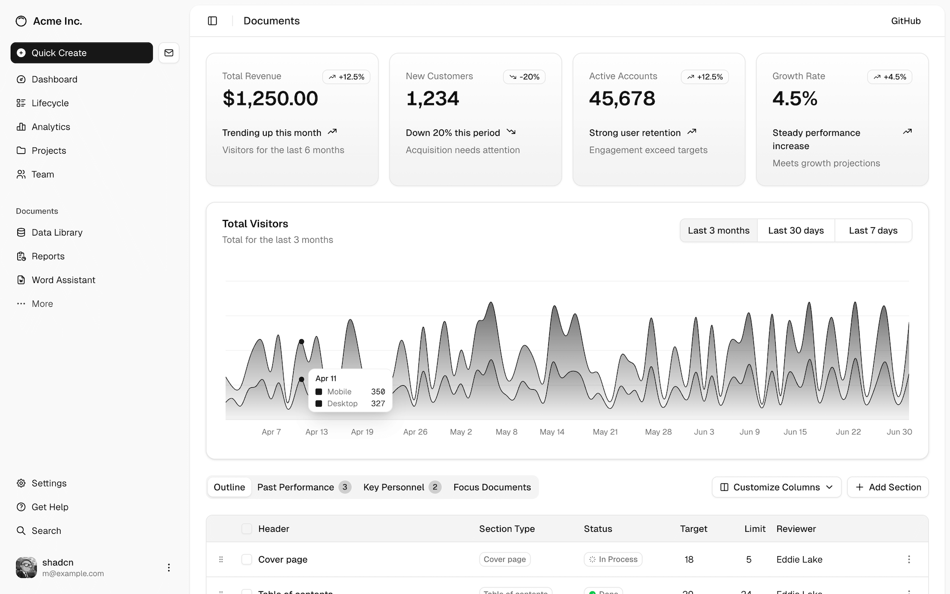
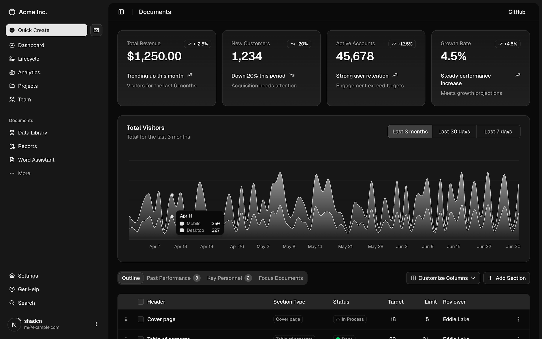
A set of beautifully designed components that you can customize, extend, and build on. Start here then make it your own. Open Source. Open Code.